
Design & Experience
Dark Mode as Strategic Brand Identity
In a saturated digital landscape, B2B decision-makers evaluate a technology company's capability within seconds of landing on its platform. Generic white backgrounds and flat templates fail to differentiate — they signal a lack of technical innovation.
Dark mode, frosted glassmorphism, and cyber-inspired geometry have evolved from visual trends into strategic brand positioning tools. Engineered with precision, a dark-themed visual ecosystem communicates technological authority and elevates brand perception.
1. The Psychology of Dark-Themed Visual Systems
Visual aesthetics aren't purely decorative — they dictate how users perceive brand maturity and technical mastery.
A. High-Tech Authority & Professional Familiarity
Engineers and CTOs spend hours in dark-themed environments — IDEs, terminals, analytical dashboards. A dark-themed visual architecture leverages that familiarity, instantly signaling enterprise-grade software rather than a basic brochure site.
B. Visual Comfort & Extended Dwell Time
Bright, unoptimized white backgrounds cause visual fatigue during long sessions. Lower fatigue means longer session durations, lower bounce rates, and more opportunity for prospects to explore complex service offerings.
Key Takeaways
- Dark UI borrows trust from tools technical buyers already use daily.
- Reduced eye strain directly extends session length.
- Perception and function reinforce each other — this isn't decoration.
2. Visual Depth Through Layering
A sophisticated dark interface reads as *layered*, not flat — each surface sits at a distinct depth rather than floating in a single plane.
Elevation comes from making higher layers slightly lighter in tone, not from drop shadows alone — the technical CSS execution for this (backdrop-filter, layered rgba surfaces) is covered in our glassmorphism engineering guide.
C. Strategic Neon Gradient Accents
In a dark environment, color is a precious commodity. Vibrant accents — warm gold, electric cyan, deep violet — must be reserved exclusively for CTAs, interactive nodes, active states, and primary metrics. Overuse turns anchors into noise.
D. Scalable Geometric & Orbital Branding
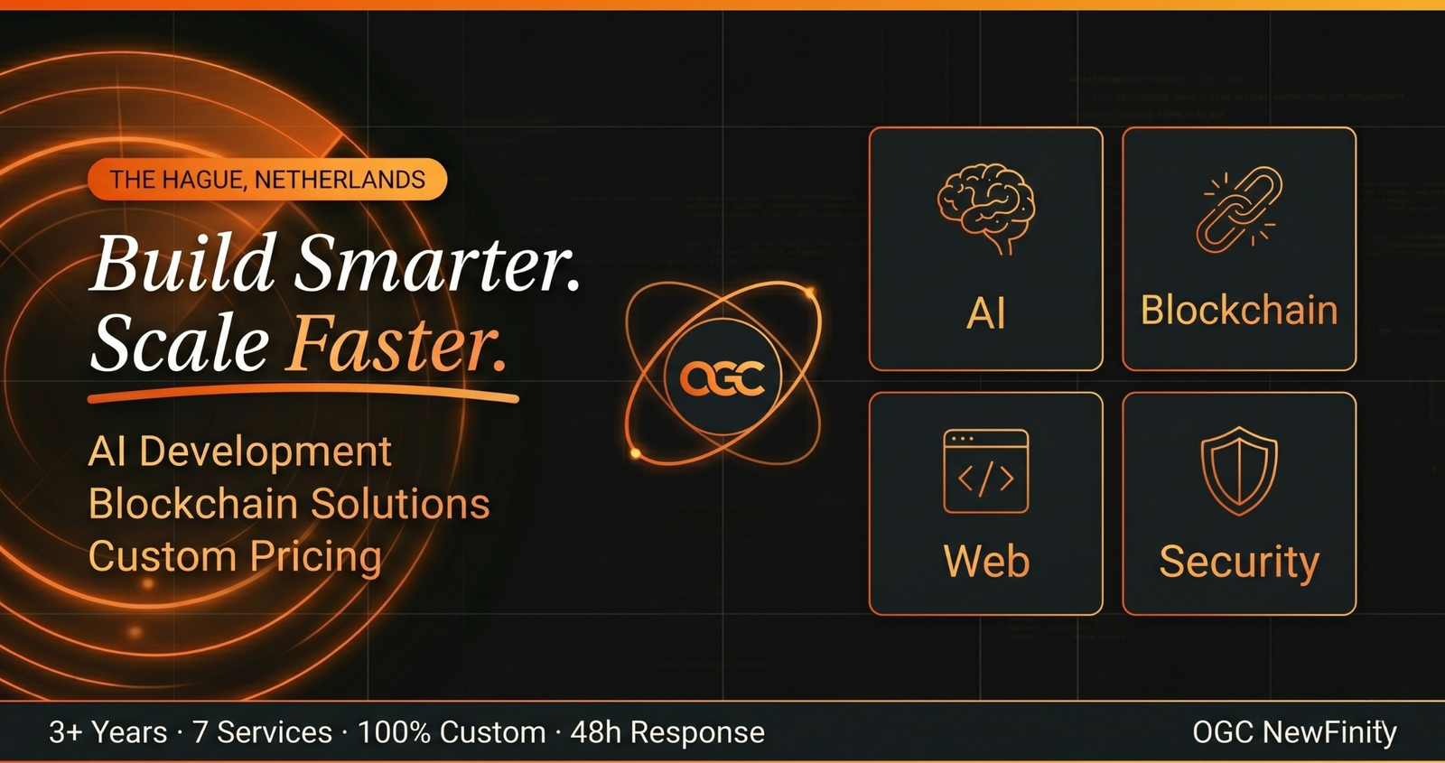
Generic photography undercuts a precision-and-innovation identity. Clean, scalable vector assets — geometric orbital paths, glowing grid layouts, vector-clean favicons — render crisply from small mobile viewports to 4K displays.
Key Takeaways
- Elevation reads through tone shifts, not shadows alone.
- Reserve accent color for a handful of high-value triggers only.
- Vector branding scales cleanly where photography breaks down.
3. Brand Identity Matrix: Traditional vs Cyber-Tech
| Design Dimension | Standard / Generic Corporate Styling | Modern Cyber-Aesthetic (OGC Standard) |
|---|---|---|
| Canvas & Palette | Flat white (#FFFFFF) with generic blue accents | Deep obsidian/slate canvas with layered charcoal panels |
| Visual Depth | Flat 2D layout or heavy drop shadows | Frosted glassmorphism, multi-layered elevation, soft radial glows |
| Brand Perception | Conventional, template-driven, standard agency | Futuristic, cutting-edge, enterprise-grade technology partner |
| Imagery & Icons | Generic stock photos & flat clip-art | Custom geometric vector assets, orbital motifs, glowing system charts |
| Typography & Contrast | Standard body text contrast | High-contrast, scannable typography optimized for technical audiences |
4. How OGC NewFinity Engineers Futuristic Brand Identities
At OGC NewFinity, we build visual architectures that reflect the high-tech nature of your enterprise, combining design concepts with rigorous frontend code.
Our brand visual engineering capabilities include:
- Dark-Mode Visual Architecture: Deep dark canvases, multi-layered glassmorphic containers, and glowing highlight systems tailored to your identity.
- Geometric & Vector Brand Systems: Clean, vector-scalable logos and orbital motifs that scale flawlessly across every touchpoint.
- High-Performance Frontend Styling: Custom Tailwind configurations and responsive micro-animations running at smooth 60fps.
- Cross-Device Contrast & Accessibility: Dark-mode palettes that meet WCAG AA contrast compliance without sacrificing impact.
Elevate Your Brand Identity with OGC NewFinity
Your platform's visual identity is your strongest silent salesperson. Moving from generic templates to a bespoke, futuristic visual ecosystem immediately positions your company as an industry innovator. Ready to transform your agency's visual identity? Partner with OGC NewFinity to engineer a sleek, dark-themed, high-impact digital presence. Contact our brand design team today for a visual strategy consultation.
Related articles
Design & Experience
Consistency Is a Feature, Not a Constraint
Why token-first design systems, not one-off component libraries, are what let small teams ship fast without visual drift.
Read moreDesign & Experience
Engineering Conversion-Driven UI/UX
How UX logic, structural visual hierarchy, and frontend performance combine to engineer digital interfaces that actually convert.
Read moreReady to build something?
Tell us what you're building — we'll point you in the right direction, free.
Submit Your Idea